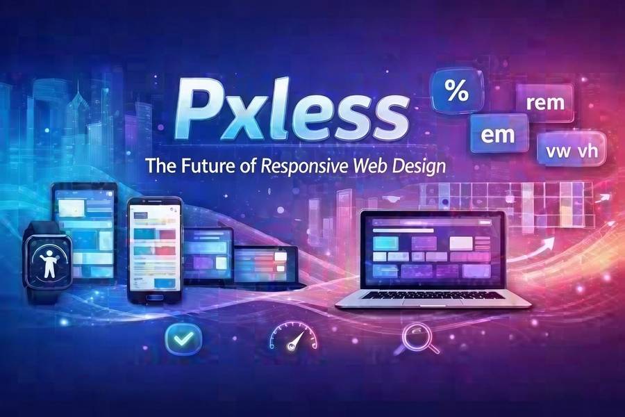
Pxless
Introduction
Have you ever opened a website on your phone, only to find the text is too tiny to read? Or maybe you have squinted at a graph on a large monitor that looked blurry and out of place. That frustration comes from a world still stuck in the past. We are entering a new era of digital design. It is called pxless. This idea is changing how we build and look at websites and apps. Instead of relying on fixed dots on a screen, pxless thinking focuses on flexibility. It makes sure your content looks amazing whether it is on a wristwatch or a giant TV. The goal is simple. We want a smooth experience for everyone, everywhere. In this guide, we will break down everything you need to know about this exciting shift. You will learn why letting go of strict pixel control actually gives you more power over your digital world. Let’s explore how you can make your online space work better with less effort.
What Does Pxless Really Mean?
At its heart, pxless is a way of thinking about design without hard rules. It means we stop telling a screen exactly how many dots to use for a picture or a button. Instead, we use smart systems that figure it out on their own. Think of it like water. Water fits into any cup you pour it into. It changes shape but stays water. Pxless design does the same thing with your content. It uses relative units instead of fixed numbers. For example, we might say a title should be “twice as big” as the normal text, rather than “32 pixels tall.” This small change makes a huge difference. It allows the design to stretch and shrink perfectly. Whether someone uses an old phone or the newest tablet, the page just works. It keeps its style and stays easy to read. This method takes the stress out of designing for so many different gadgets. It puts the focus back on the user, not the screen size .
Why the Old Pixel System Is Failing Us
For a long time, pixels were the only way to build websites. Designers would create a perfect picture using thousands of tiny squares. But the world changed. We no longer just look at the internet on a computer desk. We have smartwatches, foldable phones, and huge 4K monitors. The old system struggles to keep up. When you force a design made for one screen onto another, things break. Text might overflow its box. Images might get cropped in a weird way. Buttons might become too small to tap with a finger. This creates a bad experience for the visitor. They might leave your site and never come back. The pxless approach fixes this problem. It does not fight against different screens. It welcomes them. By using vector graphics and fluid grids, the design stays crisp. It does not matter if the screen has a lot of pixels or just a few. The image stays sharp because it is based on math, not dots . This means your hard work looks professional no matter how someone views it.
The Core Benefit of True Flexibility
One of the biggest wins with pxless design is freedom. You gain the freedom to move your content anywhere. Imagine you write a blog post today. Next year, a new type of smart glass comes out. With a pixel-based design, you would have to rebuild your whole site for that new device. That is a lot of wasted time and money. But with a pxless system, your content is ready. It adapts instantly to the new shape and size. This is called being “future-proof.” You are not just building for the phones and computers we have right now. You are building for whatever comes next. This also helps with teamwork. Designers and developers can work better together. They do not have to argue about exact numbers. They talk about the big picture. They discuss how things should feel and flow. This leads to a stronger final product. It feels more natural to use because it was built with a flexible mindset from the start.
How Pxless Boosts Your Site Speed
Nobody likes a slow website. In the United States, people expect pages to load in the blink of an eye. If your site takes too long, they will leave. Pixel-based designs often use many large image files. Every time you make a version of a logo for a different screen, you save another file. This slows everything down. Pxless methods help clean up this mess. Instead of loading five different images, the site loads one smart file. This file is often based on code, not a heavy photograph. It tells the browser how to draw the image, rather than sending the whole picture. This uses much less data. It is like the difference between mailing a heavy brick and mailing a set of Lego instructions. The instructions are light and fast. The receiver can build the same thing using the bricks they already have. This speed boost makes your visitors happy. It also helps you rank better in search results because Google loves fast sites. A fast site keeps people on your pages longer.
Creating a Consistent Brand Experience
Your brand is your promise to your customers. It includes your colors, your style, and your voice. If your website looks different on a phone than it does on a laptop, it confuses people. They might wonder if they are in the right place. Pxless design protects your brand. It makes sure your message stays the same everywhere. Because the design is based on proportions, the relationships between elements stay stable. Your logo always looks balanced next to your headline. Your buttons always have the right amount of space around them. This builds trust. When users see a smooth, consistent look, they feel more comfortable. They know you pay attention to details. This is very important for businesses trying to grow in a competitive market. A trustworthy look can be the difference between someone buying your product or buying from a competitor. Pxless helps you put your best foot forward on every single platform.
Accessibility for Every User
The internet should be for everyone. This includes people with different abilities. Some users need to zoom in to read text. Others use screen readers that speak the content out loud. Pixel-based designs can create barriers for these users. If text is locked at a specific pixel size, it might not scale up well. It could overlap or disappear off the edge of the screen. Pxless design is naturally more accessible. It allows users to adjust things to fit their needs. Because the layout is flexible, it can handle larger text without breaking. It respects the user’s settings. This is not just a nice thing to do; it is smart business. The more people who can easily use your site, the larger your audience becomes. You show that you care about all visitors. Using a pxless approach means you are building a more inclusive web. You are removing the barriers that the old pixel system created. This makes the whole online world a little bit better for everyone.
The Role of Vector Graphics in a Pxless World
You might wonder how images can stay sharp without pixels. The secret is often vectors. Think of a vector file as a set of instructions. It says “draw a line from point A to point B, curve it this way, and fill it with red.” It does not say “make this many dots red.” Because it is just math, you can make it any size. A small icon and a huge billboard can use the exact same vector file. It will look perfect in both places. This is a key part of the pxless philosophy. You are not limited by the number of dots in a picture. Icons, logos, and illustrations work wonderfully as vectors. They stay crisp and clean on every screen. Photographs are different. They are made of pixels naturally. But even with photos, pxless thinking helps. We can serve the right size for the screen without loading a massive file. We use smart code to pick the best version. This mix of vectors for graphics and smart loading for photos gives us the best of both worlds. It keeps everything looking great and running fast.
Simplifying the Design Process
Working with a pxless mindset can actually make your job easier. In the past, designers had to create multiple versions of every page. They made one for a phone, one for a tablet, and one for a computer. That is a lot of work. It is also hard to keep them all updated. If you change a button color, you have to change it in three places. With a flexible, pxless system, you design once. You focus on the rules of how things should behave. You say, “The sidebar should sit to the right on big screens, but drop to the bottom on small ones.” You build the rules, and the layout handles the rest. This saves hours of work. It also reduces mistakes. You spend less time moving boxes around and more time thinking about the user experience. This makes the whole creative process more fun. You get to solve bigger problems. You are not just fighting with pixels all day. You are building a smart system that works hard for you.
Real-World Examples of Scalable Design
We see pxless thinking in many places already. Think about a news website. On your phone, you might see one article at a time with a big menu at the bottom. On your computer, you might see a headline, a sidebar with trending stories, and ads in the margins. This is the same website, just arranged differently. It is using the same content but adapting the layout. Another great example is a music app. The buttons are easy to tap on a phone. But if you connect your phone to a car screen, the buttons get bigger so you can hit them while driving safely. If you open the same app on an iPad, you might see your playlist on the left and the album art big on the right. The app is not reloading a new page. It is just rearranging the furniture based on the room it is in. This is the power of moving past fixed layouts. These apps feel native to every device. They do not feel like a website that was squished to fit. They feel like they belong there.
Overcoming the Fear of Losing Control
Some designers worry that pxless means losing control. They think, “If I don’t set the exact pixel size, things might look messy.” But the opposite is true. You are not giving up control. You are upgrading your controls. Instead of managing every single dot, you manage the relationships between elements. You set the rules. You decide that the main content area should always be 70% of the width, and the sidebar 30%. You decide the font size should scale comfortably between a minimum and maximum. This is a higher level of control. It is like being a coach instead of a player. The coach sets the strategy. The players (the design elements) execute the play within the rules. It might feel scary at first to let go of the tiny details. But once you see how well it works across all devices, you will never want to go back. Your designs will look more intentional and professional, not less.
How to Start Your Pxless Journey
Ready to make the switch? Start small. You do not have to rebuild your whole website tonight. The first step is to change how you write your code. Instead of using px in your stylesheets, try using rem or em for font sizes. These are relative units. They are based on your main text size. If the user changes their browser settings, your text will scale nicely. Next, look at your layout. Use percentages or fr units (fractional units in CSS Grid) instead of fixed pixel widths for columns. Tell a sidebar to take up 1fr and the main content to take up 3fr. This creates a flexible ratio. Finally, switch your icons to SVG format. SVG is a vector format that scales perfectly. These small changes will make a big difference. You will see your site start to bend and flex nicely on different screens. It is the first step toward a fully adaptive and modern web presence. It puts you ahead of the curve.
The Future Is Fluid and Smart
The trend in technology is clear. We are moving toward more screens, not fewer. Our refrigerators have screens. Our glasses might have screens soon. Building everything with fixed pixels is impossible in this future. We need systems that are smart and fluid. Pxless is not just a trend. It is the logical next step. It matches how we actually use technology. We move from our phone to our laptop to our TV without thinking about it. Our digital experiences should move with us just as easily. By adopting this flexible mindset now, you are preparing for tomorrow. You are building a digital presence that can grow and change. You are also creating a better experience for the people you want to reach. They will enjoy interacting with your brand, no matter how they choose to do it. The future of the internet is adaptable, and pxless is the key that unlocks that door.
Conclusion
Moving to a pxless way of thinking is a smart move for anyone with a website. It solves the real problems of our multi-device world. It makes your site faster, your brand stronger, and your users happier. You no longer have to worry about whether your content looks right on a new gadget. You build it right the first time, and it just works. This approach saves you time and money in the long run. It also shows your audience that you care about their experience. You are not just throwing a design at them. You are crafting a journey that fits into their life, on their terms. The old days of fixed pixels are fading away. The new era of flexible, smart, and scalable design is here. It is time to embrace it and make your digital space truly limitless.
Frequently Asked Questions
1. Is pxless only for big companies with big budgets?
Not at all. Pxless is more of a mindset than an expensive tool. Anyone can start using relative units like “rem” or “em” in their website code for free. It is about working smarter, not spending more money.
2. Will my old website images work in a pxless design?
Yes, they can. For photographs, you can use modern “srcset” code. This lets the browser pick the right size image file for the screen. For logos and icons, it is best to switch to SVG files, which are vector-based and scale perfectly.
3. Does Google prefer pxless websites?
Google prefers websites that offer a good user experience. This includes fast loading times and mobile-friendly layouts. Pxless design directly helps with both of these things. A fast, responsive site will generally perform better in search results.
4. Is it hard to learn how to design without pixels?
If you already know how to build websites, it is an easy shift. You just change the words you use in your code. Instead of width: 300px; you write width: 50%;. The concepts are the same. You are just giving the browser more freedom to make the final decision.
5. Can I mix pixels and relative units?
Yes, you can. Many designers use a “hybrid” approach. They might use pixels for tiny, fixed things like a border line that should never change. But for layout and text, they use relative units. The goal is to be flexible where it matters most for the user.
6. What is the biggest mistake people make when going pxless?
The biggest mistake is forgetting to test. After you make your site flexible, you must look at it on many devices. Open it on a real phone and a real tablet. Make sure the design still looks balanced. Testing helps you catch small issues before your visitors do.
About the Author